Glassmorphism
玻璃拟态
Aliases:毛玻璃苹果那种透明玻璃效果玻璃拟态磨砂玻璃玻璃效果半透明模糊背景Frosted GlassGlassmorphism UI
What is it
A visual language that expresses floating layers as frosted glass: a blurred backdrop (backdrop-filter), a low-opacity fill and a thin white rim of light. Panels literally reveal the vivid background beneath them, so the style is about depth — it only works over rich, colorful content worth revealing.
Design spec
Typography
Sans-serif with white display type
Color
Blue-purple-pink gradient with white glass rgba(255,255,255,.45)
Border
1px translucent white borders
Shadow
Large soft coloured shadows
Spacing
16px+ radii with roomy card padding
Motion
200–300ms ease-out transitions for movement and blur; honour prefers-reduced-motion
States
Hover raises opacity and blur and lifts slightly; focus shows a visible white ring; active lowers the glow; disabled loses opacity and blur; error tints the glass red, fading colour only
Style in action
The same page, ready to useStart creating and Try it now open creation. Turn an idea into an editable local draft; assistant, simulated sync and the original Flexible export entry explain the corresponding features. Actual export saves the current draft as .txt; save/restore a page snapshot and return to editing. Label AI and cloud sync as local simulations.
Full-page preview · interact directly
What to look for
- 01Use Aurora’s original navigation and primary CTAs; inspect content and return paths, not just click notices.
- 02Complete the Aurora task, then change inputs or undo and inspect the matching result/state.
- 03Check reflow, focus and validation with keyboard and 390px / 320px viewports; distinguish toolbar reload from in-page clearing and inspect reset-on-reload boundaries.
✓ When to use
- Over gradients, photos or colorful backdrops worth revealing
- Overlays, players and floating system panels that should feel light
- Evoking the familiar macOS/iOS material language
✕ When not to use
- Plain backgrounds — frosted glass over nothing is just grey fog
- Long-form reading areas where blur keeps eroding text contrast
- Performance-sensitive or older devices — backdrop-filter is costly
Variants
Frost
磨砂
High blur, low opacity — the classic milky glass
Clear Glass
透明玻璃
Light blur, high transparency, leans on the light rim
Tinted Glass
有色玻璃
Color-tinted glass, the iOS vibrancy tradition
Implementation
backdrop-filter: blur()background: rgba(255,255,255,0.1~0.4)border: 1px solid rgba(255,255,255,0.4)box-shadow: inset 0 1px 0 rgba(255,255,255,0.5)@supportsThree ingredients: a translucent fill (white at 10–40% opacity), backdrop-filter blur(8–24px), and a 1px translucent white top rim that sells the glass thickness. It shines on dark backgrounds — add an inner top glow. Always gate with @supports and fall back to a more opaque fill where backdrop-filter is unsupported. Verify text contrast against the blurred result, not the raw backdrop.
Agent prompts
Four prompt layers run from “what it is” all the way to a ready-to-run task. On the Agent task layer you can stack a visual style and extra requirements, then copy it to your coding agent in one click.
Build a complete Aurora page in this style, extending the original hero into content, concrete operations and return paths rather than isolated controls or a partial demo. Preserve brand, hero copy, assets, composition, tokens and all variants. Keep preview.brand aligned with shared REFERENCE_BRANDS; ReferenceStyleScene defines the hero structure, actual navigation and assets.

Keep Aurora’s snowy dusk photograph, translucent blue-violet light layer and 38% / 30% / 26% columns with 3% gaps, not a replacement generic gradient. The feature list uses its existing translucent white gradient, 1px white rim and blur(9px); the separate chart uses blur(8px), inset highlights and a pink bloom. Retain white CTAs and sans display placement. The continuation uses its existing pale blue-violet surfaces and blur(14px) sections, stacking below 600px. Dark/variants follow existing surface/light selectors without inverting the photograph.

Full-page operations:
Start creating and Try it now open creation. Turn an idea into an editable local draft; assistant, simulated sync and the original Flexible export entry explain the corresponding features. Actual export saves the current draft as .txt; save/restore a page snapshot and return to editing. Label AI and cloud sync as local simulations.

Share one renderer between static covers, the detail experience and /style-scenes/glassmorphism/ (English /en/style-scenes/glassmorphism/). Static covers contain no nested live buttons; the detail experience enables the same page’s semantic controls and brand continuation in an independent document. Original navigation and CTAs reach actual content or workflows, not placeholder links, color-only changes or one-line toasts.

Interaction state lives only in this page’s memory. Reload, toolbar reset and mode changes restore initial state; do not use localStorage or sessionStorage. In-page clear/reset undoes this visit’s operations without implying cross-page or persistent saves.

Provide return, cancel or clear/reset paths and disclose the page-memory state boundary; never fake real payments, email, login, AI or cloud sync. Reflow desktop, 390px and 320px layouts with readable text and usable targets rather than shrinking the desktop page. Give controls accessible names, keyboard access and visible focus; overlays close and return focus, validation/results are announced; respect prefers-reduced-motion.

Add no dependencies. Check both languages, original navigation/CTAs, concrete results, return/reset and narrow reflow; report checks actually run and pending items, never requirements as passed results.

Additional requirements:
- Dark mode support
- Respect prefers-reduced-motion
- No new dependencies
- Run existing checks and list modified files
Hand to your coding agent — stack a style and extra requirements on top
Related concepts

A visual language that borrows real-world materials and physical forms for digital controls: leather stitching, wood grain, brushed metal, glass gloss. Buttons look pressable, switches look like levers — highlights, shadows and bevels make "what it looks like" teach "how it works".
StylesSimilarAn atmosphere built from large flowing gradient blooms: teal, violet and blue blurred blobs drift and merge across the background while the foreground stays minimal. Color is the protagonist — soft, cross-hue, aurora-like transitions that give the interface breath and warmth.
StylesSimilar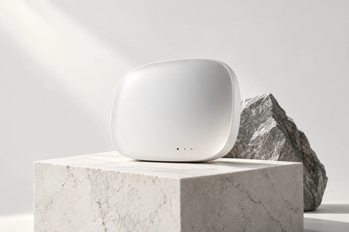
A visual language built on "less is more": generous whitespace, a restrained monochrome palette and very few type scales let the content speak. All decoration is stripped away; hierarchy is created purely by space, weight and rhythm. Quiet, restrained, content-first.
StylesSimilarA self-contained rectangular container outlined by rounded borders or a surface colour, aggregating related content: cover, title, excerpt and actions. The universal display unit of content feeds, dashboards and commerce lists.
ComponentsAffectsA dialog rendered above the page with a translucent backdrop that interrupts the current flow and demands a task or decision first. The backdrop blocks interaction with the underlying page and focus is temporarily trapped inside — the most disruptive of the overlay containers.
ComponentsAffects